Branding in the Package: Lessons from Apple’s Master Marketers
My new Apple iPad is a technology dream, creating a web experience unlike anything I’ve ever seen.
Like all Apple products, it’s driven by brilliant engineering and extraordinary user-friendliness. It’s also a case study in branding excellence.
Here’s how Apple used its product packaging to deliver on its brand promise and support a smart marketing strategy.
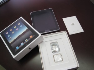
Simplicity: Apple’s look is always simple and clean and the packaging for the iPad is true to the brand. The art on the cover of the box is a life-size photo of the product inside. No words, no sell copy. Since this is exactly what the customer can’t wait to get their hands on, it’s the perfect marketing message, building anticipation and making the product the star. The only other art on the package is the Apple logo and the product name on the sides of the box. The product specs (16GB, 3G, etc.) and copyright are hidden on the back at the bottom. Nothing gets in the way of the brand.
 Consistency: The packaging and the product are as beautiful, clean, and easy to access as every other Apple product. Opening this box felt just like opening the package for my iPhone and my iPod, and this trademark simplicity and consistency are exactly what Apple buyers want and expect from the company. Even the accessories in the box are familiar. The iPad uses the same USB cable as other Apple products.
Ease of Use: Apple’s TV advertising for the iPad notes that “you already know how to use it,” and if you’re at all familiar with other Apple products, they’re right. The product’s controls and user interface are so intuitive that you can quickly get up to speed and start using the product. There’s no thick owner’s manual in multiple languages, just a simple, two-sided card that leads you to product instructions on the web and in the product itself, though you really don’t need them unless this is the first time you’ve purchased from Apple.
Quality: The silk paper stock for the box and “how to use” card are extremely high quality, with a soft, rich finish, a dull varnish, a slightly creamy color, and a silver metallic foil stamp on the Apple logo. Even the box feels great to the touch. Instead of looking for ways to save money with a cheap box and an inexpensive paper stock, Apple made the package an extension of the product itself.
So what can we learn about branding and marketing strategy from these master marketers? Here are four key lessons:
- Know what your customers expect from your brand and deliver it in all aspects of your product, from the product design to the package you ship it in.
- Your brand is much more than your logo: it’s everything the customer experiences when they interact with you. Evaluate all your customer touchpoints to be sure they truly reflect your brand.
- Simplify your message and communicate it as directly as possible. Edit copy to its essence and wherever you can, use visuals to make your points.
- Be you, all the time. Great brands convey a company’s persona and they do it so consistently that the company feels like something more than a commercial enterprise. Your brand persona should be a reflection of who you are and what makes you different from every other company in your marketplace. Keep it consistent and keep it real.


Craig
Jean,
Apple certainly leads in the area of design and packaging. Now if we could get them to still do that but lower their prices…
Ryan
i’m quite amazed really, with the time and attention to detail Apple has given to their products. From the user interface, to the product design, to its very packaging. Its clean and appealing. there are not that many brands out there that give as much attention to their products as Apple does. but of course, the drawback is that they are more expensive than other brands and it comes that we pay for the brand more than the products itself.
jeangianfagna
Interesting point, Ryan. I’m sure you’re right that the investment Apple makes in branding is a contributor to the cost of their products, but the value of the products is so high that the cost seems justified. Look at the sales figures out today for first quarter 2012 sales; the iPhone and iPad are flying off the shelves because they are terrific products. I use both daily and I truly believe they’re worth what I paid for them. Do you use Apple products, too? What do you think?
Nate Webster
Some say that Apple has fallen off but I think a segment of their base is just trying what else is out there. Cool design and intuitive UI will keep people coming back. Customers are often willing to pay a premium for the coolest out there.
jeangianfagna
Good points, Nate-I agree completely. They have so much insight into how people use devices and know very well how to translate the simplicity of their intuitive UI into their packaging. They’ll be hard to beat for a long time to come. Thanks for reading the blog and sharing your comments.
Pingback:Logo and branding concepts | timhandblog
Pingback:Consumer Behaviour and Packaging – cml994