A Branding Blunder Averted: Ohio Almost Makes a Classic Marketing Mistake
The state of Ohio has been saved from a big branding blunder by the bad economy.
Every one of the 11,944,527 cars licensed in the state carries two mini-billboard ads for Ohio: the front and back license plates.
The new “Beautiful Ohio” plate was set to become the standard plate in 2009, but state officials shelved the plan after deciding that Ohio drivers might object to paying an extra $2.50 to cover the plate’s printing costs during a recession.
 Instead, just one million “Beautiful Ohio” plates are available as specialty plates that cost an extra $7.50 per car – and that’s good branding news for Ohio.
Why? Because the “Beautiful Ohio” plate makes a classic branding and marketing mistake: Obscuring the name of the product through “creative” graphic design.
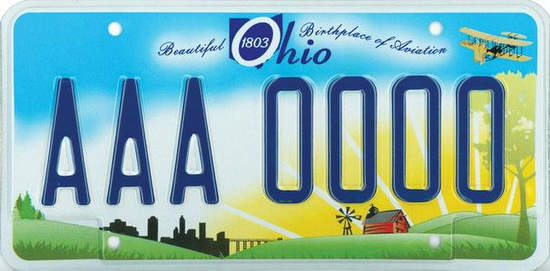
In fact, it’s hard to imagine what else the designers could have done to bury the brand. Take a look at the plate design:
- The text selected for the brand name (Ohio) is a hard-to-read typeface in italics and three of the four letters are in a type size that’s too small;
- The capital “O” of Ohio is reversed out of a solid blue background shaped like the state, which awkwardly fills in the letter and becomes a dark blur on the highway;
- The year of the state’s founding, 1803, is reversed out of the middle of the letter “O,” making a clumsy visual element even more confusing;
- The copy before and after the state’s name is a script font that’s virtually unreadable, unless you’re on your knees installing the plates on your car;
- The busy design has too many visual elements: a city, a bridge, a barn, a windmill, an airplane, a sunrise, and the state’s outline.
Also, the state has once again positioned the brand “Ohio” at the very top of the plate design, where it’s guaranteed to be hidden by every license plate frame holder on the market.
The new plate design probably looked great on a big screen or display board in a conference room at the state’s offices, enlarged several hundred percent. But on the streets – where the rubber meets the road, as they say – it’s a disaster. And if the recession hadn’t forced a change in the state’s plans, eventually it would have appeared on nearly every car in Ohio.
Ohio is not alone in missing the boat on license plate design; take a look at this Wikipedia gallery of state license plates to see other examples.
Granted, a license plate may not be the best platform for effective branding due to its limited dimensions and the fact that the plate’s most essential message – the license number – must be communicated in the middle of the space. But if you had the chance to make millions of impressions every day with your organization’s name and image, wouldn’t you capitalize on it?
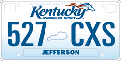
Kentucky did. The state designed a clean, attractive license plate whose main visual element is its “Kentucky Unbridled Spirit” branding, the official logo of the brand strategy that applies to all of Kentucky’s tourism marketing and promotion – including its license plates.
 According to Kentucky’s website, “A brand is an identity given to a product to make that product more desirable to the consumer. And in our case, the ‘product’ is the Commonwealth of Kentucky….Research has recently shown that in less than two years, The ‘Kentucky Unbridled Spirit’ brand is having a positive impact upon consumers’ perception of the state and their intent to visit the state. Twenty-three percent of the respondents said the brand gave them a more favorable perception of the state, up 7.3% from the first year of branding. Also, 48% said they were more likely to visit Kentucky, an increase of 8.6% over year one.”
Imagine the impact if Ohio officials had followed Kentucky’s lead and recognized the state’s license plate as a branding opportunity. Suppose they created a visually striking graphic design that showcased the brand in a readable, engaging, and memorable way and linked to the state’s tourism marketing campaign. Ohio would be making millions of powerful, positive impressions on people everywhere, every day. And that would be a smart branding strategy.


Pingback:Ohio marketer praises ‘Kentucky Unbridled Spirit’ brand | New West Public Relations, Advertising & Marketing
jeangianfagna
News flash: The state of Ohio announced on March 31 that “Beautiful Ohio” will become the state’s standard issue license plate, citing the fact that sales of Beautiful Ohio have outpaced the prior standard issue plate (a sunburst) by a 3-to-1 margin.
I’m not sure the statistics prove that this new plate is so much more popular than the old plate, which was very unattractive and much less colorful. No doubt, lots of people like the design, especially compared to its predecessor.
But when evaluted for its branding power, it’s still extremely weak and a very confusing design. And it looks like we’ll now be seeing it a lot more often.
Don
This marketing nonsense has gone way out of hand. Does everyone have to be so superficial? The purpose of a license plate is to identify the car when an accident, traffic violation, or crime has been committed. Its one overriding design criterion should be readability — not advertising.
This should be obvious to anyone who can count beyond 10 with his shoes on. We already have too much advertising. Bland and readable is fine with me. It projects an image of being practical and sensible.
jeangianfagna
Good news, Ohio drivers: The state is finally ditching this awful design (which has earned the nickname “Farmville”) in favor of a new, more straightforward approach. What a relief.
http://www.wtam.com/cc-common/news/sections/newsarticle.html?feed=122520&article=9443373