Anatomy of a Smart Direct Mail Letter: 7 Copywriting Tips
As a marketing consultant and lifelong direct marketer, I’m always on the lookout for examples of direct marketers who are doing it right—who understand the art of effective direct mail and know how to create a package, catalog, postcard, or dimensional mailing that demands the prospect’s attention and rewards their engagement.
I recently received such a direct mail package at my home in Cleveland, Ohio. It’s a great example of how to craft a smart direct mail letter.
Here’s a profile of the letter and why it worked, with seven direct mail copywriting tips to try in your smart marketing strategy.
7 Classic Direct Mail Letter-Writing Tactics
A few weeks before my most recent birthday, Stonebridge Life Insurance sent me a direct mail package offering a term life policy. If I responded before turning a year older, I’d get a better rate.
Using birth data is a common approach in life insurance direct marketing. But this package stood out because of the way the marketer combined the data about my birthday with proven letter-writing tactics that old-school direct marketers know and love.
Here are seven classic direct mail copywriting tactics Stonebridge used in their letter:

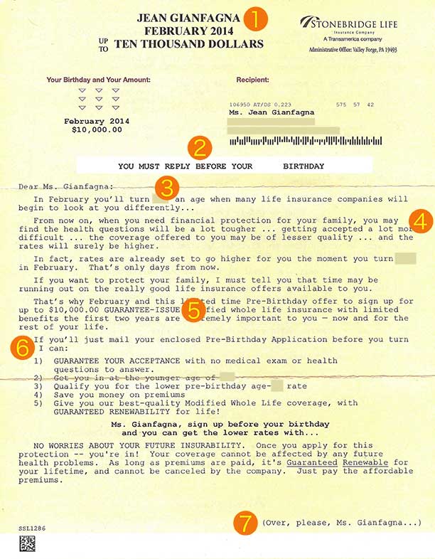
- Use a bold Johnson Box with a personalized message: A Johnson Box is a block of copy above the salutation that summarizes the mailing’s key message and immediately engages the reader. This Johnson Box is in a bold, all-caps font with three simple copy points-my name, my upcoming birth month, and the amount of insurance they’re offering: Up to TEN THOUSAND DOLLARS.
- Make a strong call to action with a deadline at the top of the letter: A can’t-miss line just above the salutation in all caps makes the key point: YOU MUST RESPOND BEFORE YOUR XXTH BIRTHDAY.
- Engage the reader right away with a highly relevant opening sentence: “In February, you’ll turn XX, an age when many life insurance companies will begin to look at you differently….”
- Clearly state the consequences of not responding: The mailer paints a vivid picture of the trouble I could have if I don’t respond: “From now on, when you need financial protection for your family, you may find the health questions will be a lot tougher…getting accepted a lot more difficult…”
- Repeatedly emphasize the key product benefit: The best feature of the Stonebridge insurance product is guaranteed acceptance and renewability. This benefit is stated four times on page 1 and four times on page 2.
- Repeat the call to action – over and over: There are eight calls to action in this letter urging me to respond, with additional calls to action on the reply form and inserts.
- Personalize the page-turning instructions: This letter uses one of my favorite direct mail letter tactics, a personalized page-turning message to get the recipient to keep reading from page 1 to page 2: (Over, please, Ms. Gianfagna…).
A Final Tip on Writing an Effective Direct Mail Letter
One of the best lessons I learned when I began my career as an advertising copywriter was to write copy like you’re writing to a friend.
Whether you’re creating a direct mail letter, web copy, an email, brochure, or Tweet, picture the individual who will receive your advertising message. What do they care about? Why should they read what you’re writing? Focus on the reader’s needs to develop content that resonates with the audience and generates a response.


Mark Barton
Love it Jean! Johnson Box, yes! I haven’t seen that page-turner recently either. Keep up the good work.
jeangianfagna
Thanks, Mark-I’m really glad you found this helpful. I do love that page-turner tactic–more direct marketers should use it!
Linda Turner
This is a great reference Jean, I get these in the mail and never took the time to put it all together the way you did. Great Tip!
jeangianfagna
Thanks, Linda: I’m glad you found it helpful. I’m always glad to see a marketer use the tried-and-true tactics of effective direct mail.
Pingback:15 Minutes to Fame: Rise to the Occasion - Wealthy Web Writer
jeangianfagna
Thanks for sharing my blog post with your readers.
Margie Dana
Excellent piece, Jean – really loved that you included a picture of the letter and highlighted what worked so well. It’s a keeper – your post, that is!
Margie
jeangianfagna
Thanks, Margie. I was glad to share a picture of the letter. Direct marketers always study the design and formatting of every element of a DM package; the little details like text centering, fonts, underscoring, etc., can make a big difference in the readability and appeal of the letter. Appreciate your comments!
David Hunter
Great example for copywriters and marketers!!!
One thing I love to do with my marketing is to make “doodles.” My cousin just got me a tablet (no, not the tablet you’re thinking of), so I can draw and make my own doodles for my sales copy. 🙂
jeangianfagna
Thanks, Dave. Good idea on the doodles!
Pingback:Anatomy of a Smart Direct Mail Letter: 7 Copywr...
Cathy
Thanks for the post! These 7 tips are great, especially the ones that incorporate the bolding off fonts. That’s a great way to draw attention to important content.
Pingback:7 Reasons Banks Fail at B2B Direct Marketing
Catherine Marshall
Great tips! Deadlines and simple calls to actions make it easier for the customer to follow up and take action. Thanks for sharing!
jeangianfagna
Thanks, Catherine-glad you found it helpful.